


PITA LAVASH
FOR IFOOD
⬡ PACKAGING

↓
ABOUT THE PROJECT
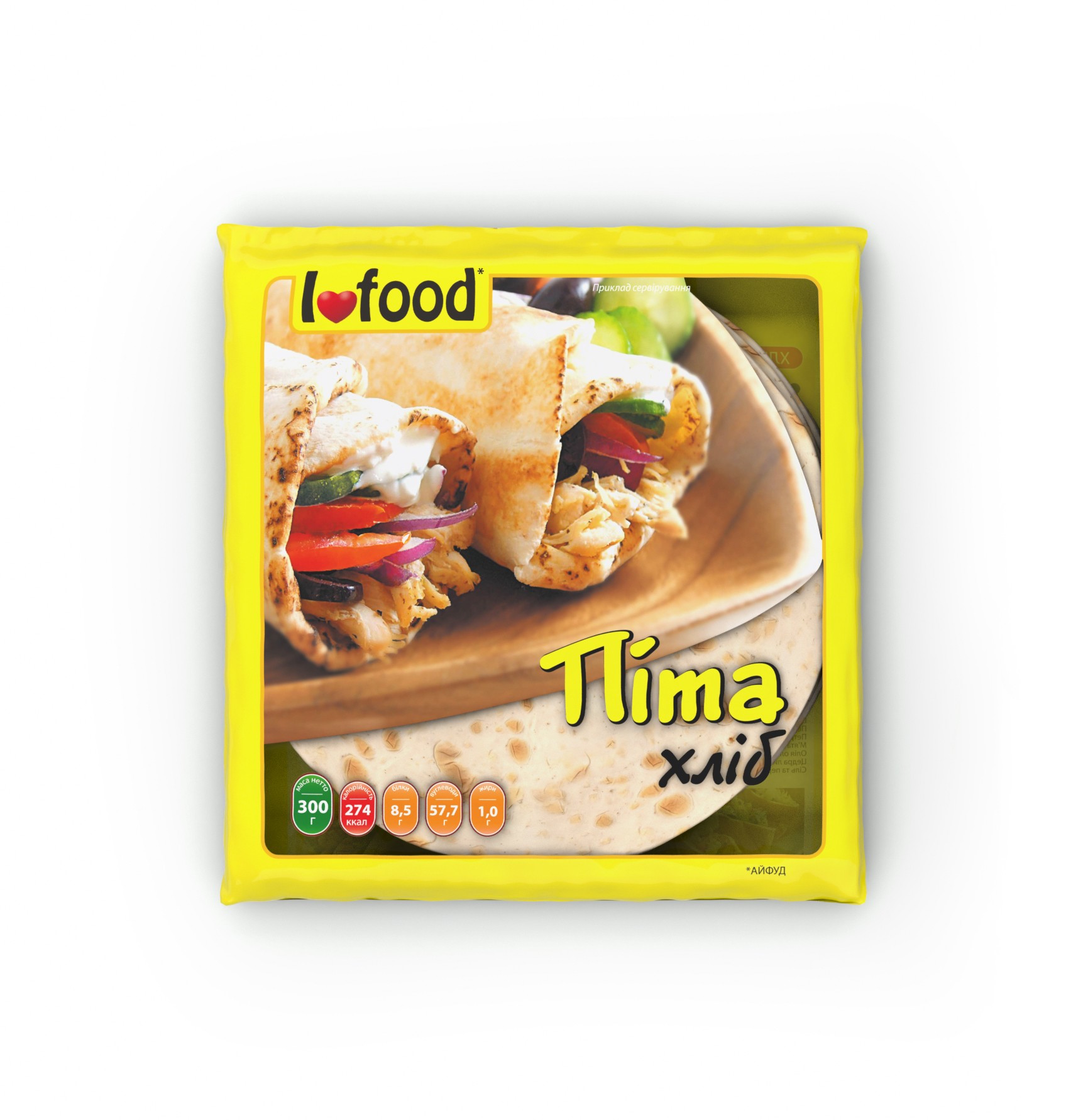
Due to the fact that pita was not popular in Ukraine at the time of product development and consumers were reluctant to consume this type of bread, we were faced with the task of involving consumers having shown the practicality of Pita bread in everyday life, when you need a quick snack or when there is no time for cooking, ifood offers to use freshly baked Pitas, because everything is simple with Pita. You just wrap it up and its done.
BRIEF
➊ We want the consumer to have associations with the product to make it easier to perceive its productivity.
➋ We want the consumer to have an idea of how they should use the product when looking at the packaging.
➌ We want the packaging to arouse an appetite.
WHAT DID WE DO
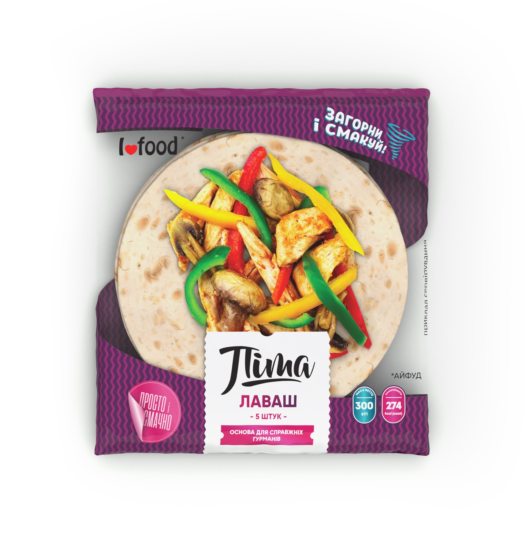
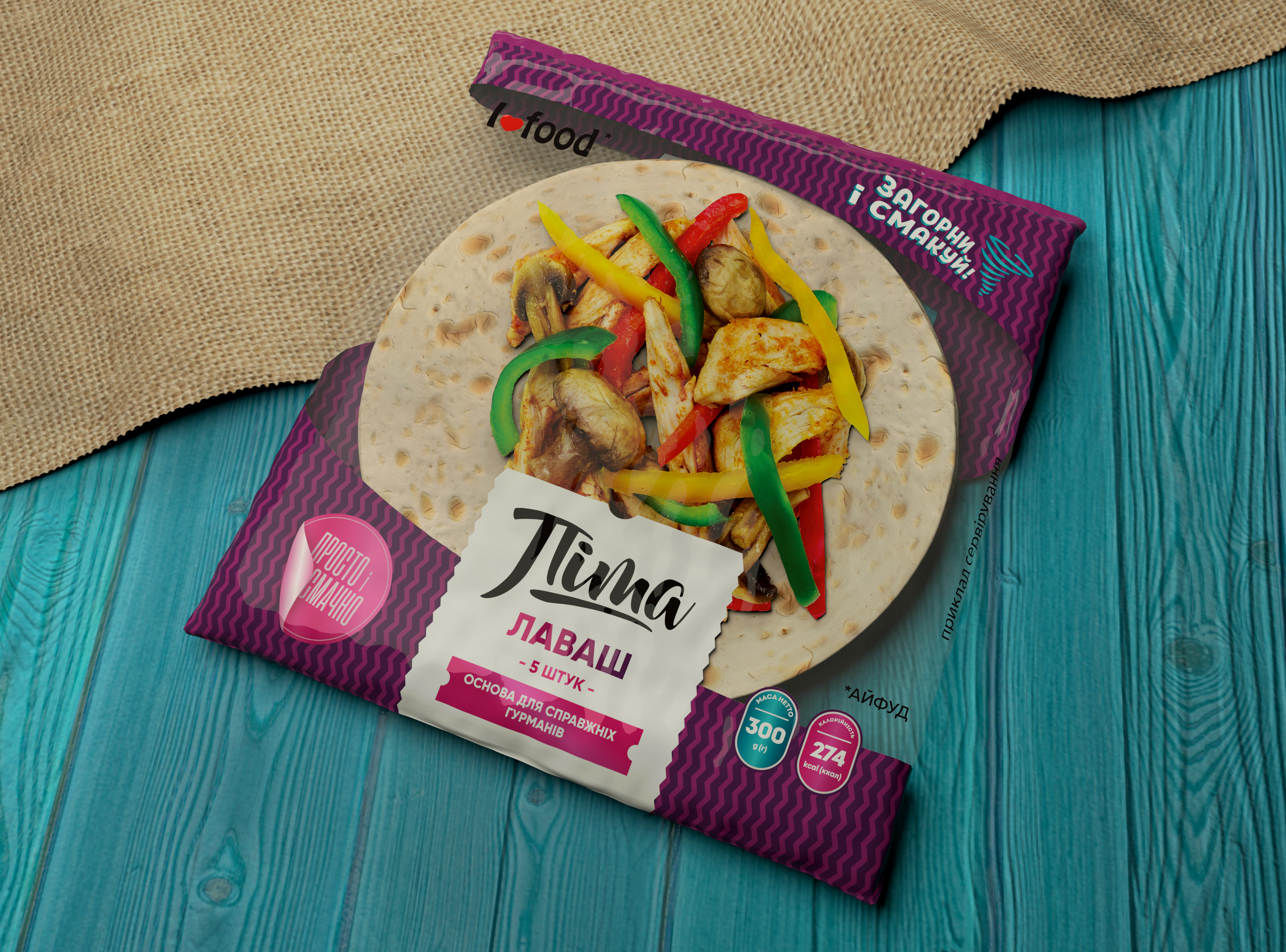
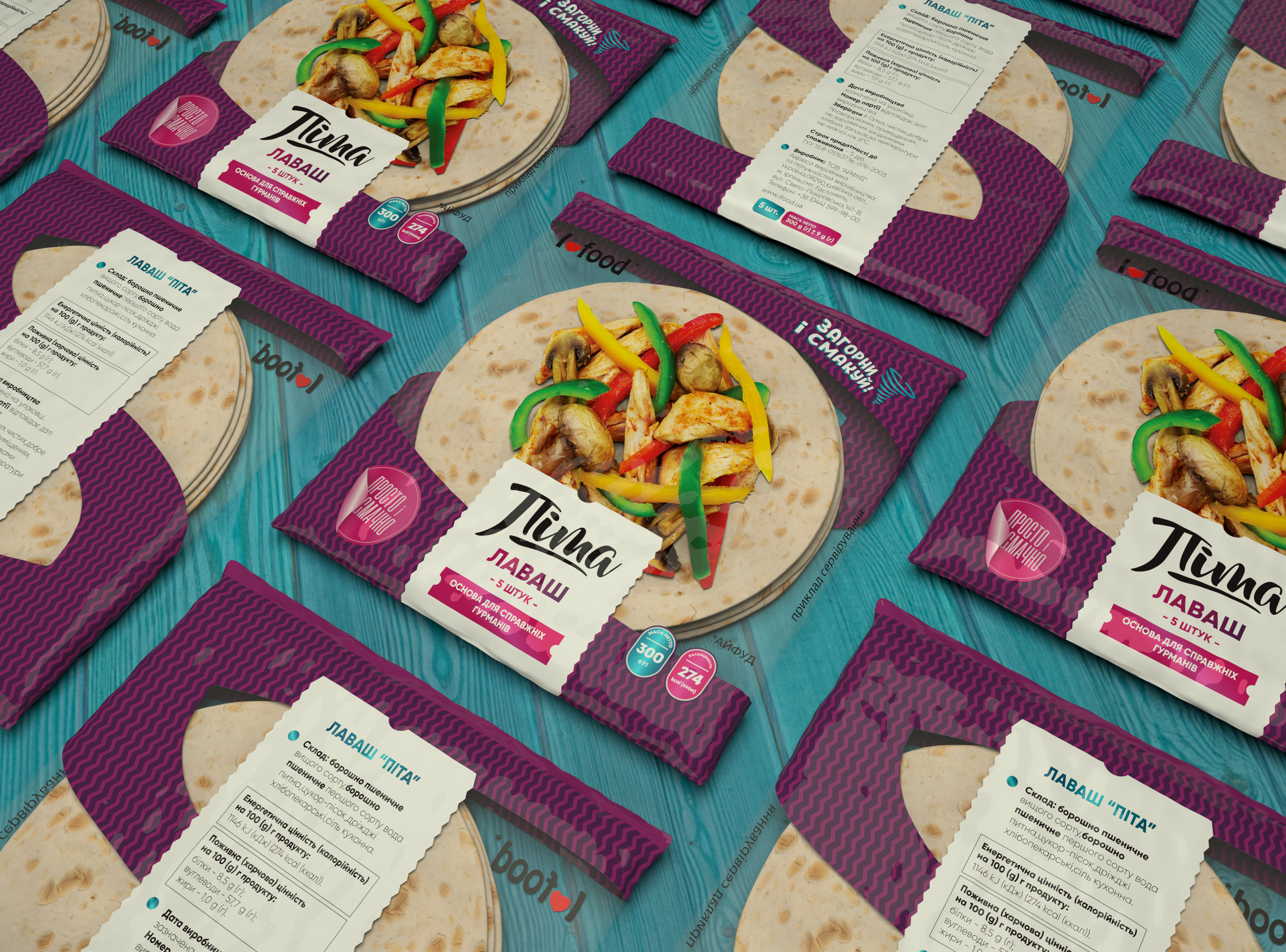
➊ Just above the name Pita, we added the name of a similar in composition and type of bread that is Lavash.
Consumers have been familiar with this product for a very long time, so we created associations that will
help people quickly navigate when choosing bread.
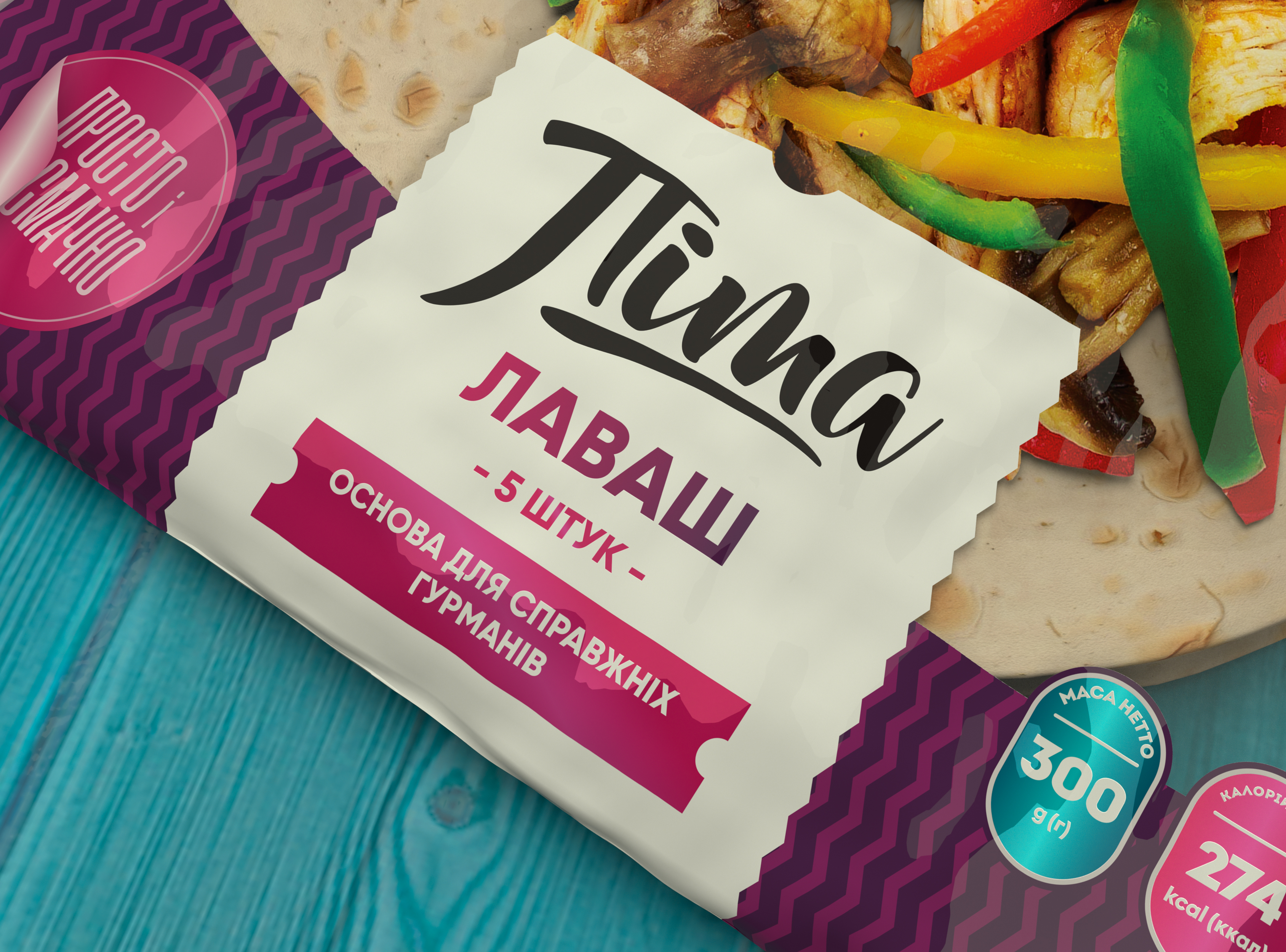
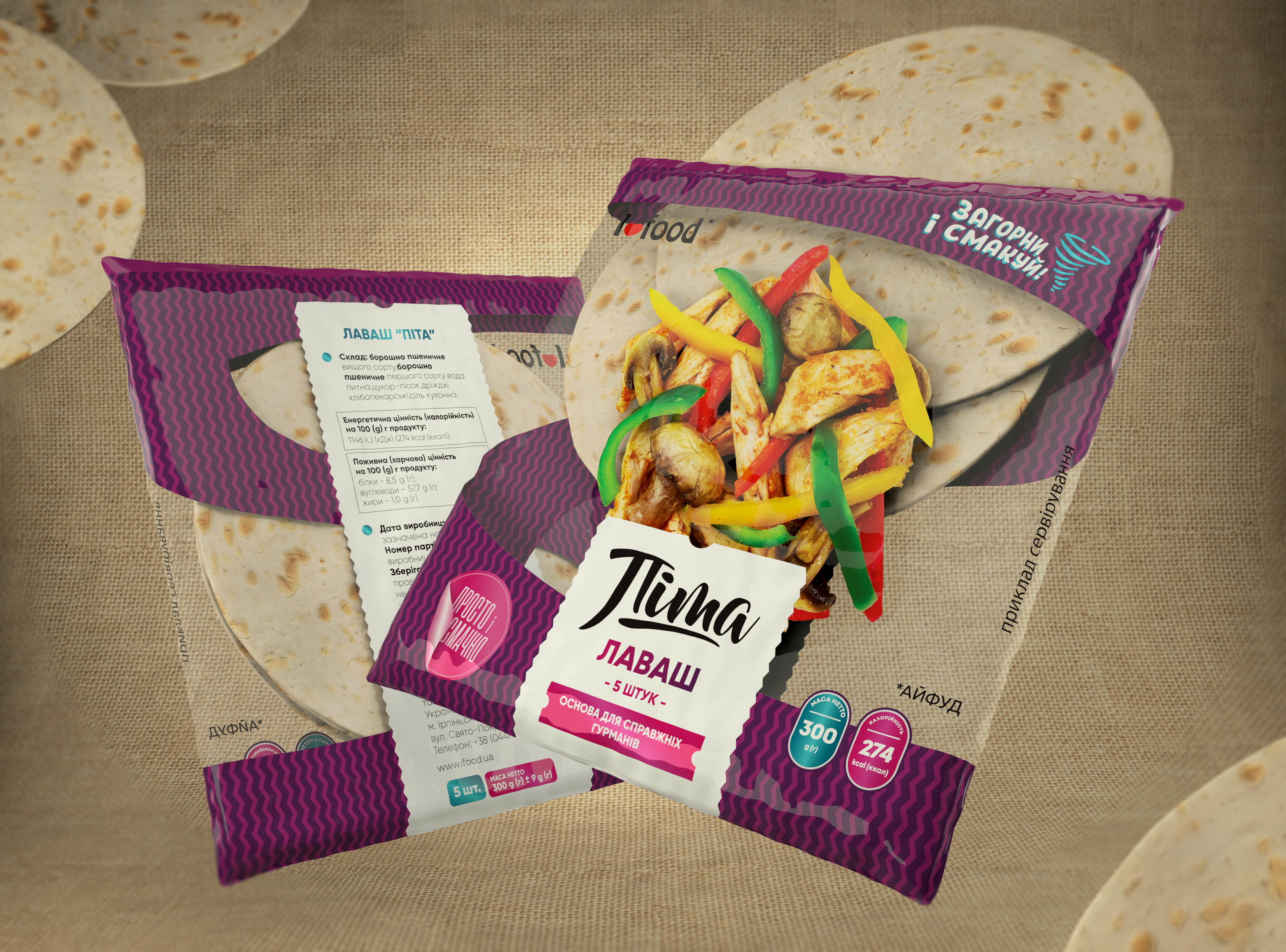
➋ First, we have developed a frame of the package which, at the subconscious level, demonstrates the idea of application. We added tornado icon on the top corner of the package and next to it we added a Slogan: “to wrap and savour” and on the bottom corner we added a slogan: “simple and delicious”.
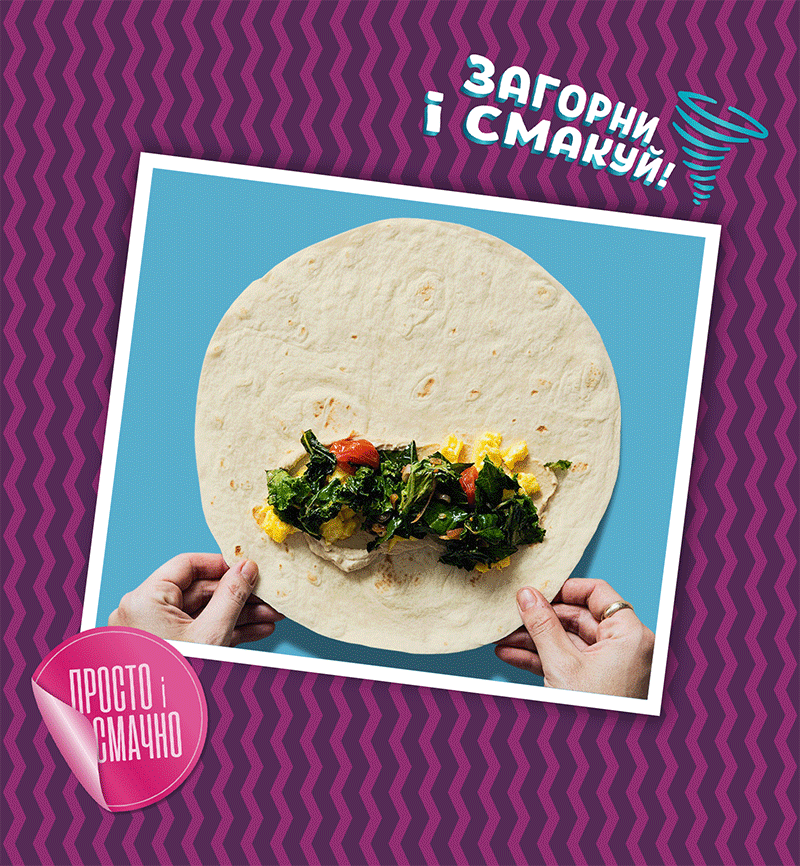
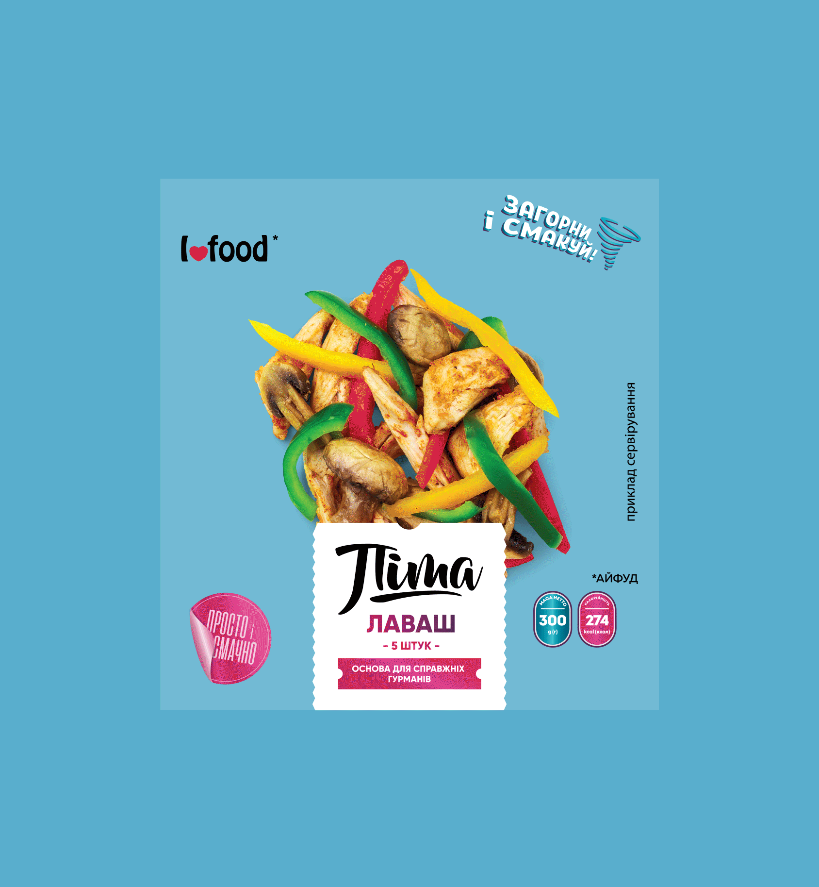
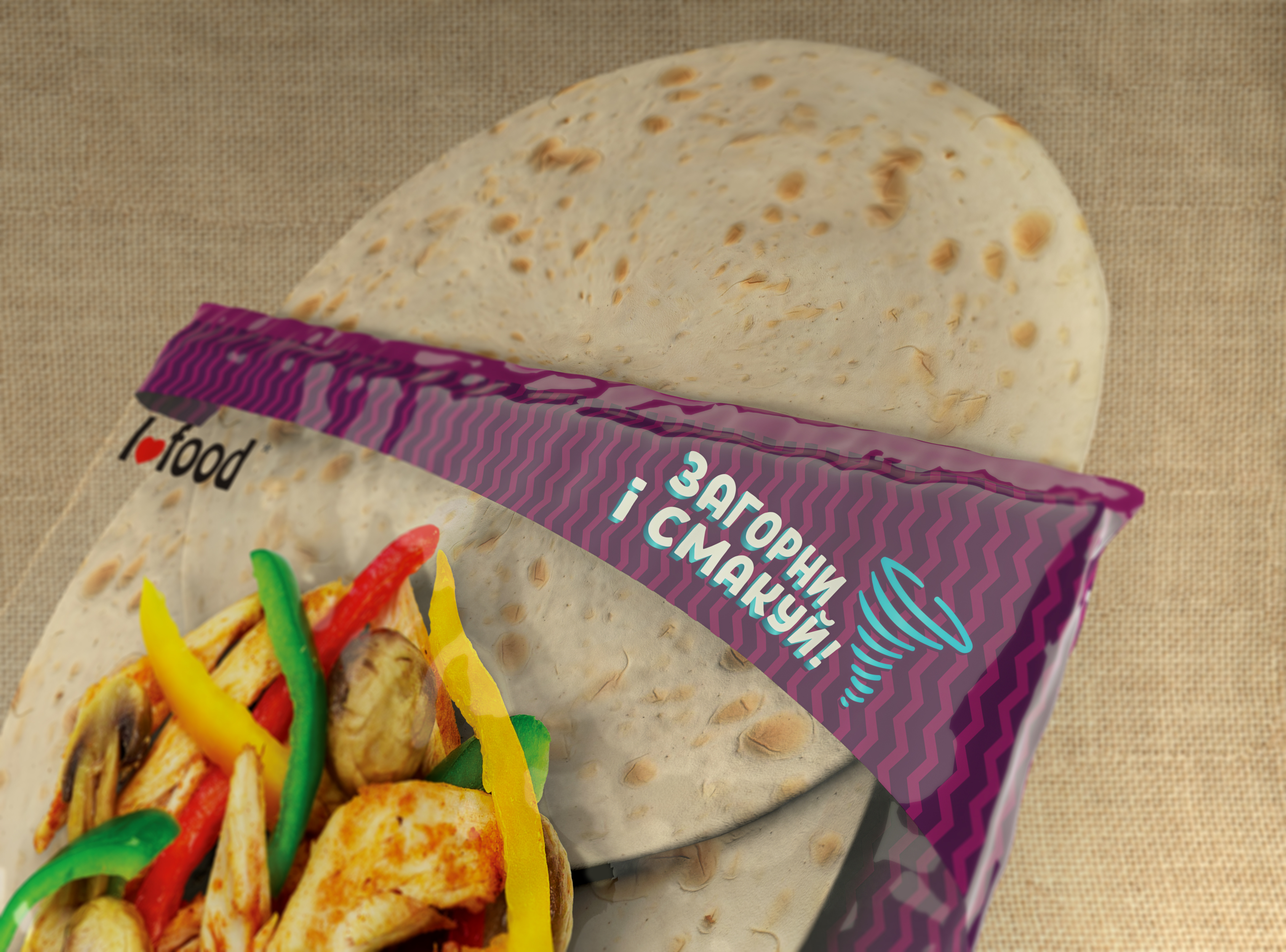
➌ To arouse consumers' appetite and add an extra bonus of the product usage, the central part of the packaging was made transparent so that the pita was completely visible and on a transparent background we added chicken, mushrooms and bell peppers, thus showing the final result. The consumers can simply fantasize what they want to add to the pita before
wrapping it, and the purple color of the packaging puts the finishing touches of product perception which brings the associations of gastronomic as well as aesthetic values of the product.
Finally, we know that the numbers do not lie and for this reason we requested an annual report on the product sales dynamic and analyzed it and as a result, the rebranding of this product increased sales numbers up to 20-25%. The IFood company continued to cooperate with us and together we re-branded one more product and developed 2 more new products. Follow us and we will definitely catch up with you for the upcoming new projects.
RELATED PROJECTS

BABY PITA
⬢ PACKAGING

SANDWICH
⬢ PACKAGING

URBAN YEREVAN
⬢ PACKAGING