


SANDWICH
⬡ ՓԱԹԵԹԱՎՈՐՈՒՄ
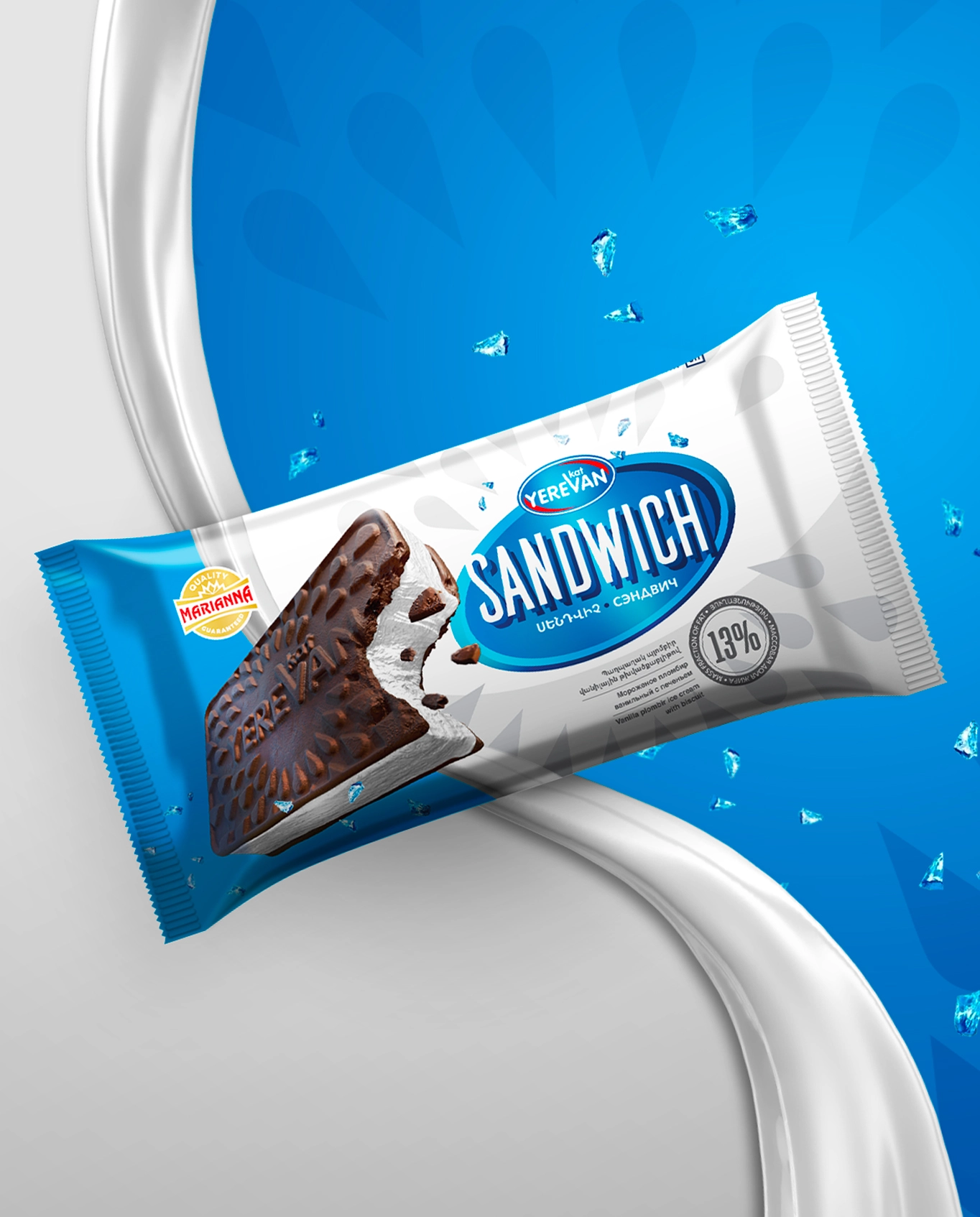
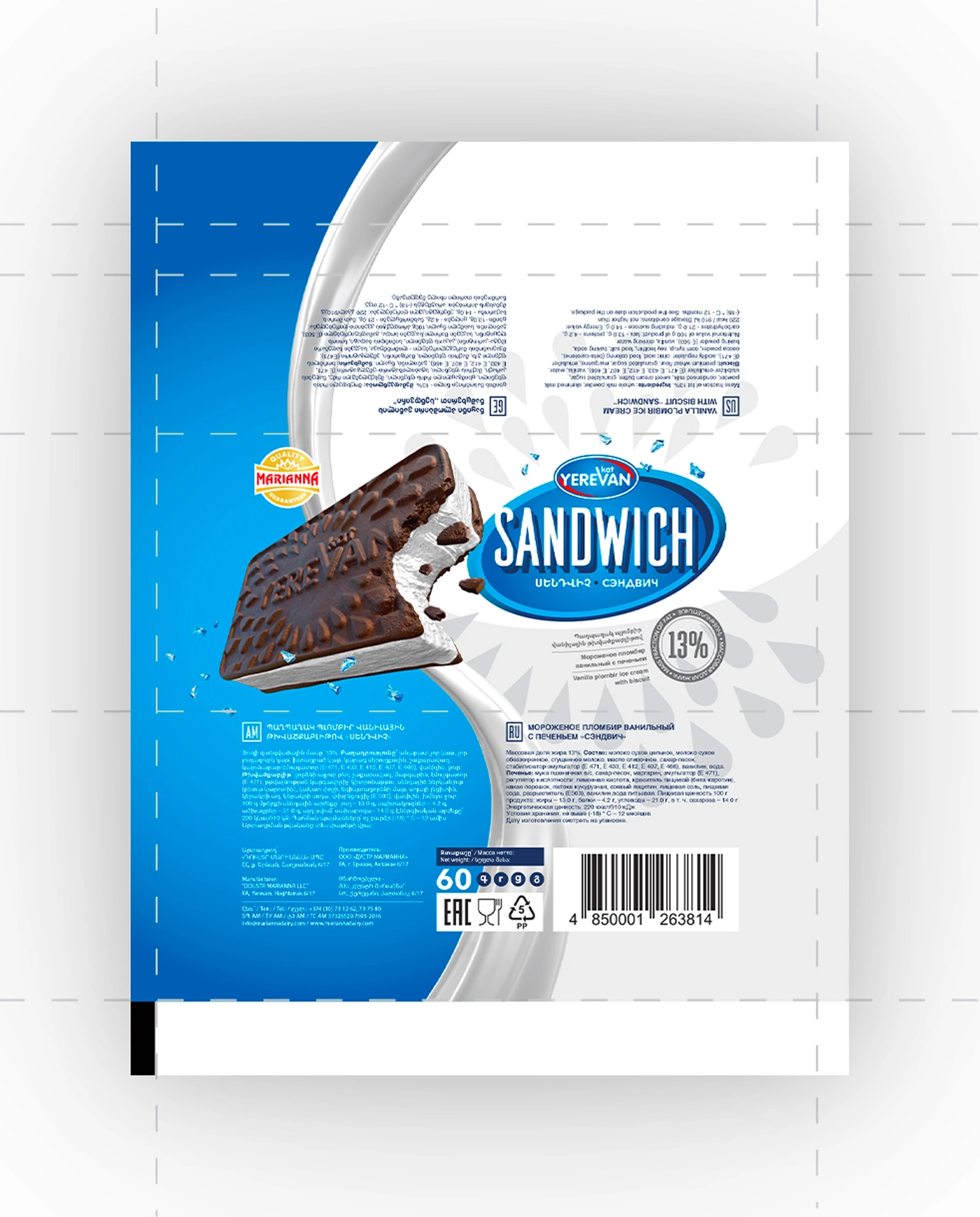
Sandwich պաղպաղակի փաթեթավորման դիզայն Երևան կաթի համար։ Այս պաղպաղակը, երկու կողմերից թխվածքաբլիթների շերտերով է պատված, տեսողականորեն հիշեցնում է Sandwich և ստացել է իր անունը դրանից։ Մեր նախագծի հիմնական նպատակն էր արտադրանքը մանրամասն ներկայացնել՝ հաշվի առնելով, որ դրա տեսքը հասանելի է միայն փաթեթը բացելուց հետո։
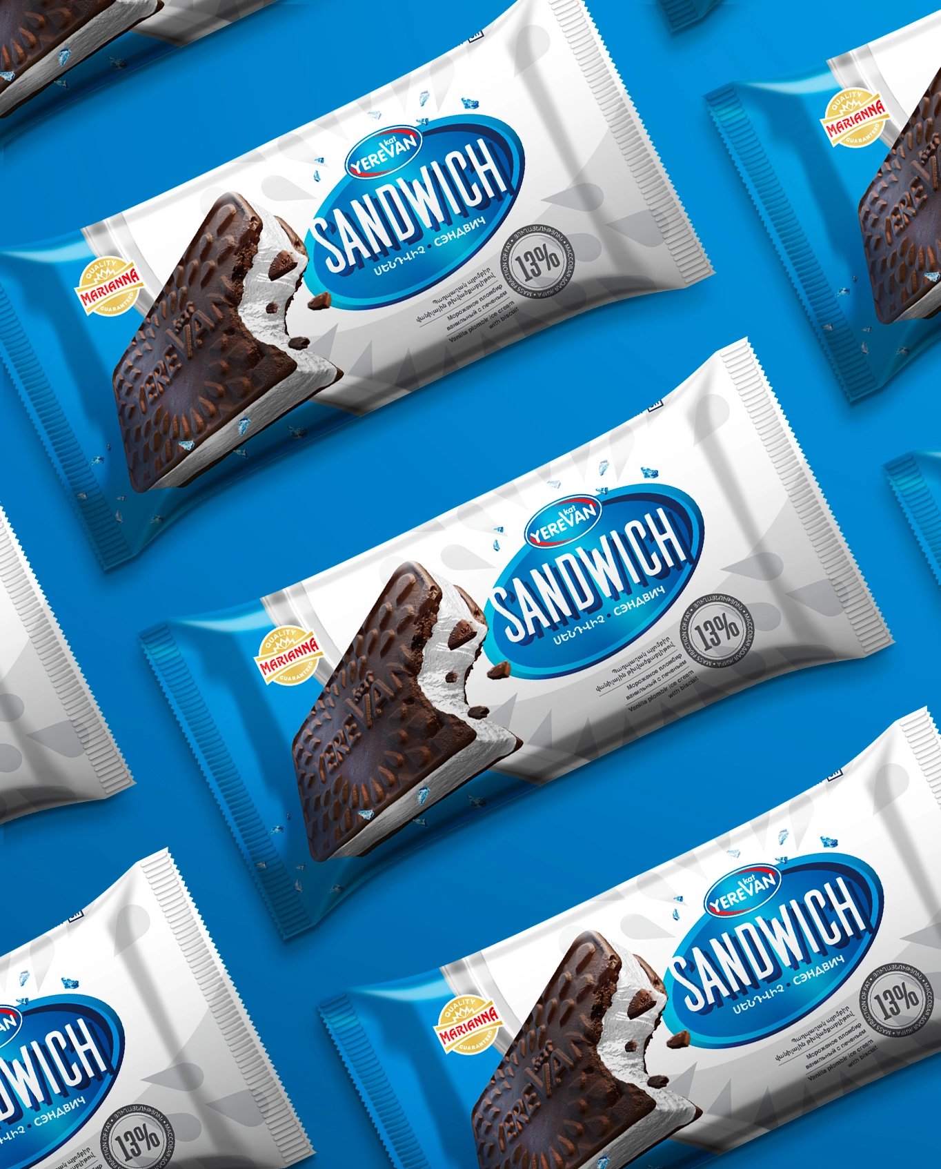
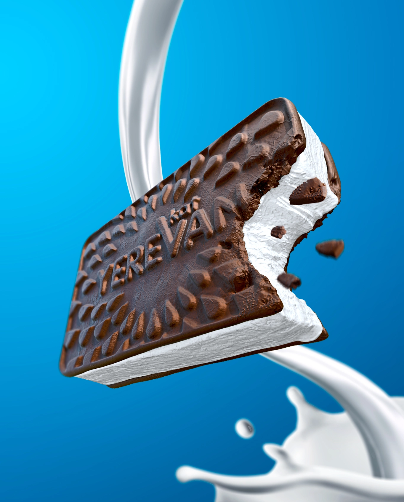
Մենք մշակեցինք թխվածքաբլիթի մակերեսի դիզայնը՝ ընտրելով կաթիլանման ձև, որը այս դեպքում խորհրդանշում է կաթի կաթիլ։ Լոգոն ինտեգրեցինք մեջտեղում, որպեսզի սպառողները ավելի հեշտորեն ճանաչեն արտադրողին։ Հետո ստեղծվեց արտադրանքի եռաչափ մոդել՝ առավելագույն մանրամասնությամբ ցուցադրելու համար։
Ընդհանուր առմամբ, փաթեթավորումը ներկայացնում է դասական և ժամանակակից ոճերի հարմոնիկ համադրություն, որը որոշվել է ընկերության նպատակային լսարանի նախասիրությունների ուսումնասիրության արդյունքում։ Գույների ընտրությունը պայմանավորված է լոգոյով՝ նպատակ ունենալով ստեղծել միաձույլ ընդհանուր տպավորություն, որը խորհրդանշում է ընկերության լոգոյի արժեքները։
ՀԱՐԱԿԻՑ ՆԱԽԱԳԾԵՐ

BABY PITA
⬢ ՓԱԹԵԹԱՎՈՐՈՒՄ

MARIANNA CHEESE SET.
⬢ ՓԱԹԵԹԱՎՈՐՈՒՄ

URBAN YEREVAN
⬢ ՓԱԹԵԹԱՎՈՐՈՒՄ