


BRANDING
FOR HOOKAHYAN
⬡ BRANDING
Initial Idea and Challenge
A client approached us with an ambitious idea — to create a lounge bar in the heart of Yerevan, built around signature cocktails and hookah culture. From the start, it was important to communicate that this was more than just a bar or hookah café — it was a thoughtfully designed space for relaxation, elevated service, and an Armenian-inspired atmosphere. The project was also envisioned as a future international franchise, meaning that every element — from the name to the visual language — had to be unique, recognizable, and scalable.
Naming and Cultural Code
We began with naming. After conducting market research and analyzing global trends in the industry, we explored several directions that could reflect both the product and its origin. We ultimately arrived at the name Hookahyan — a blend of "Hookah" (the core product) and "yan," a suffix commonly found in Armenian surnames, symbolizing cultural identity. The name is memorable, easy to pronounce globally, and distinct — meeting the requirement of being unregistered and franchise-ready in any country, while staying true to its roots.
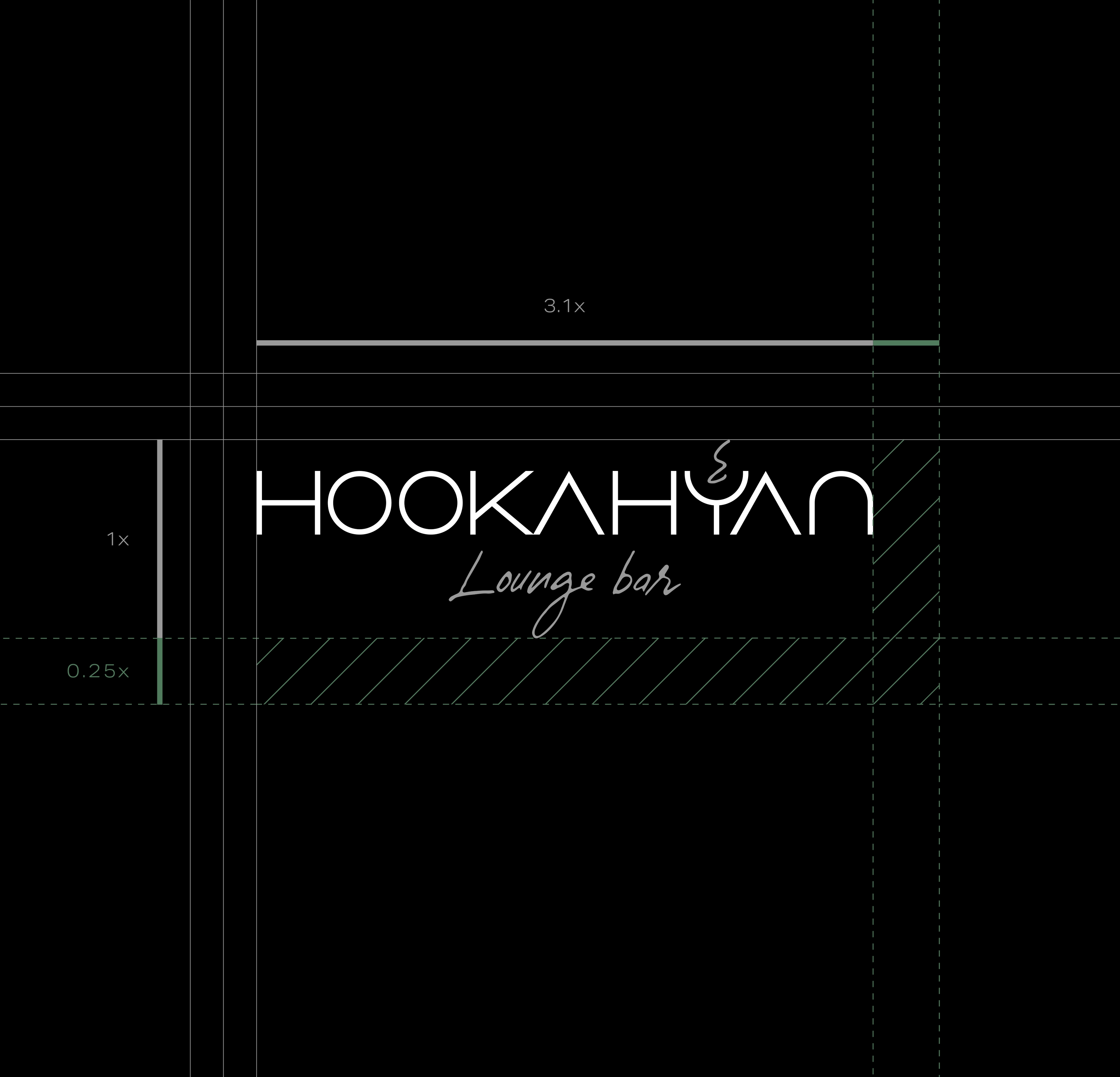
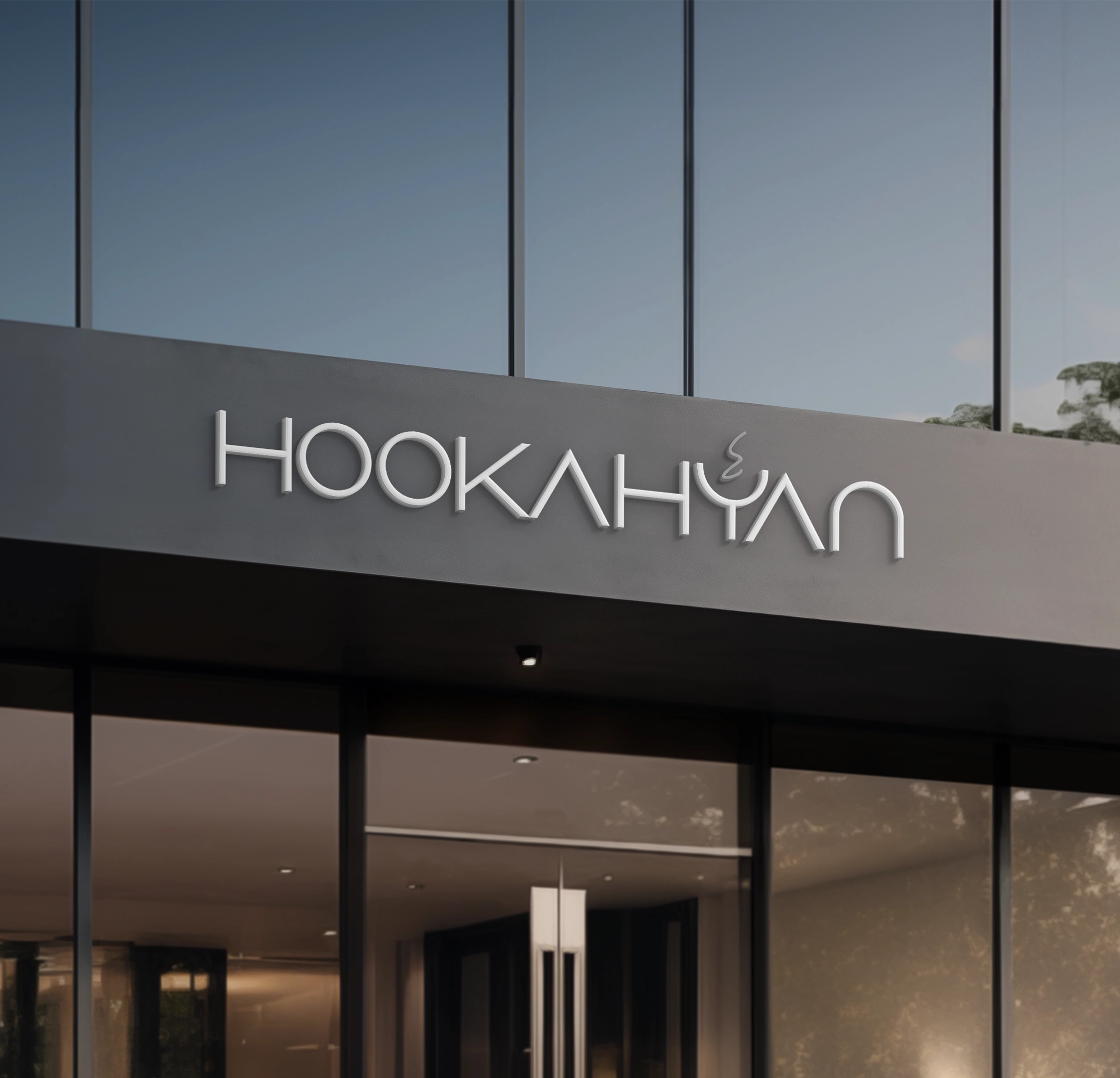
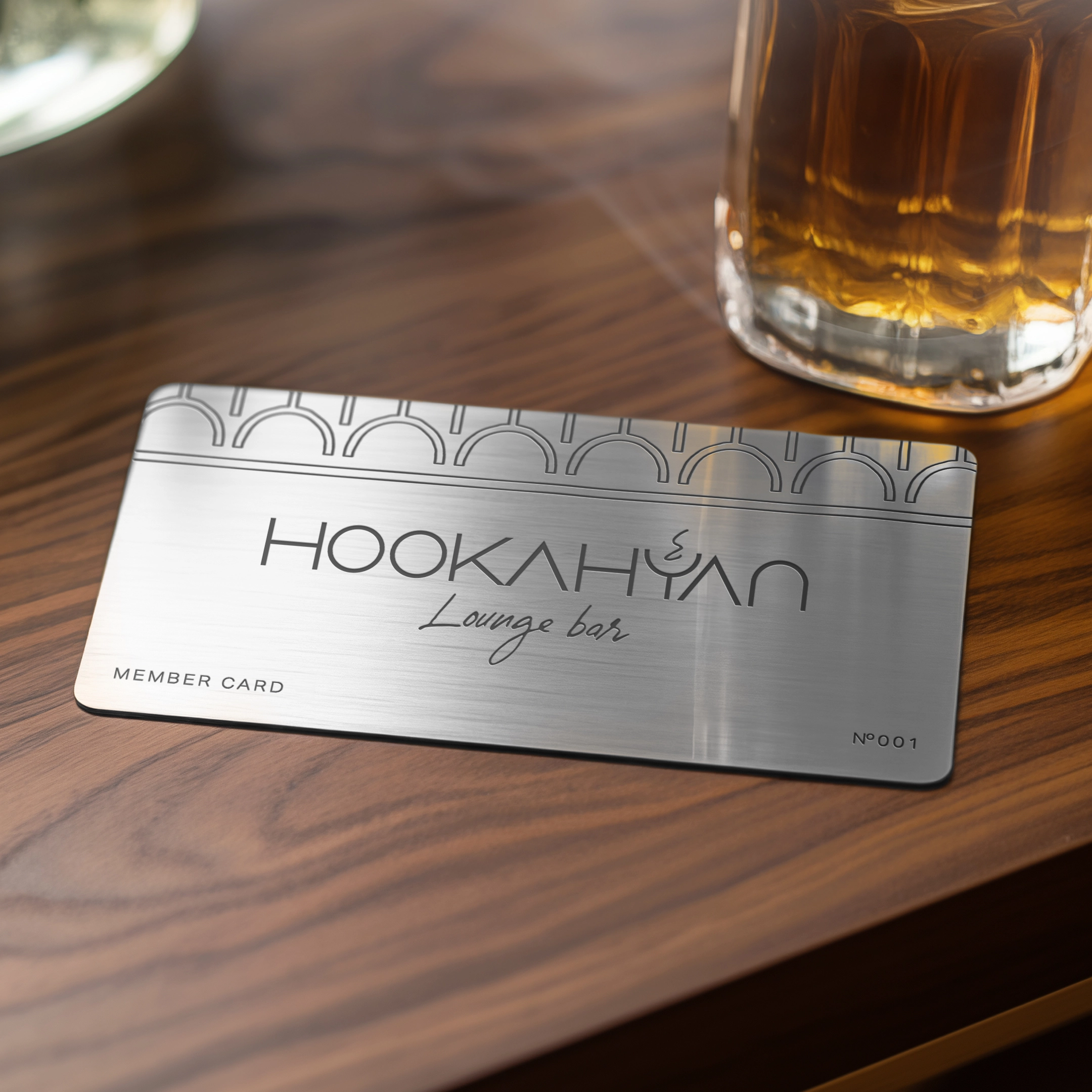
The Logo as a Core Symbol
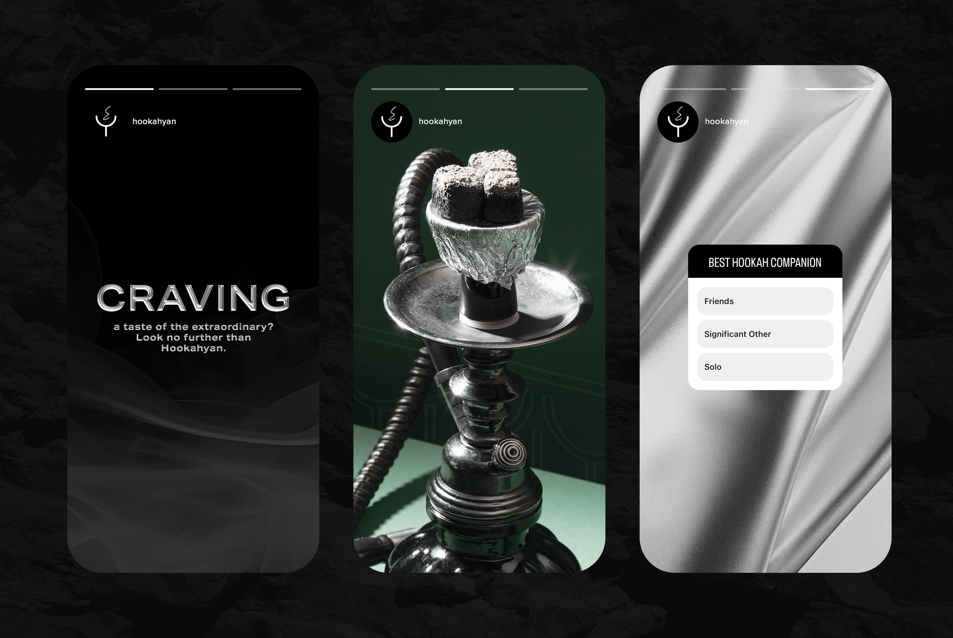
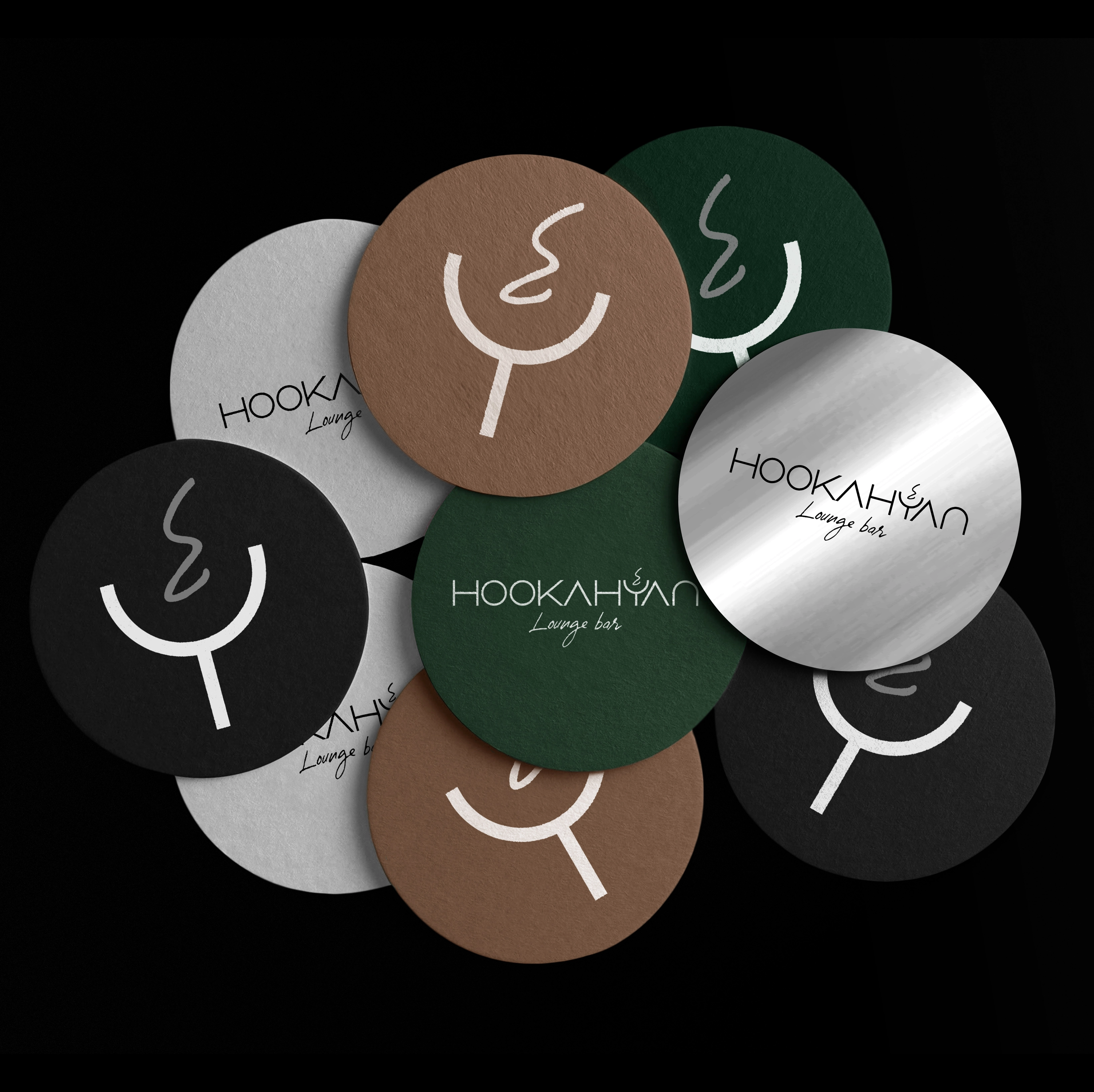
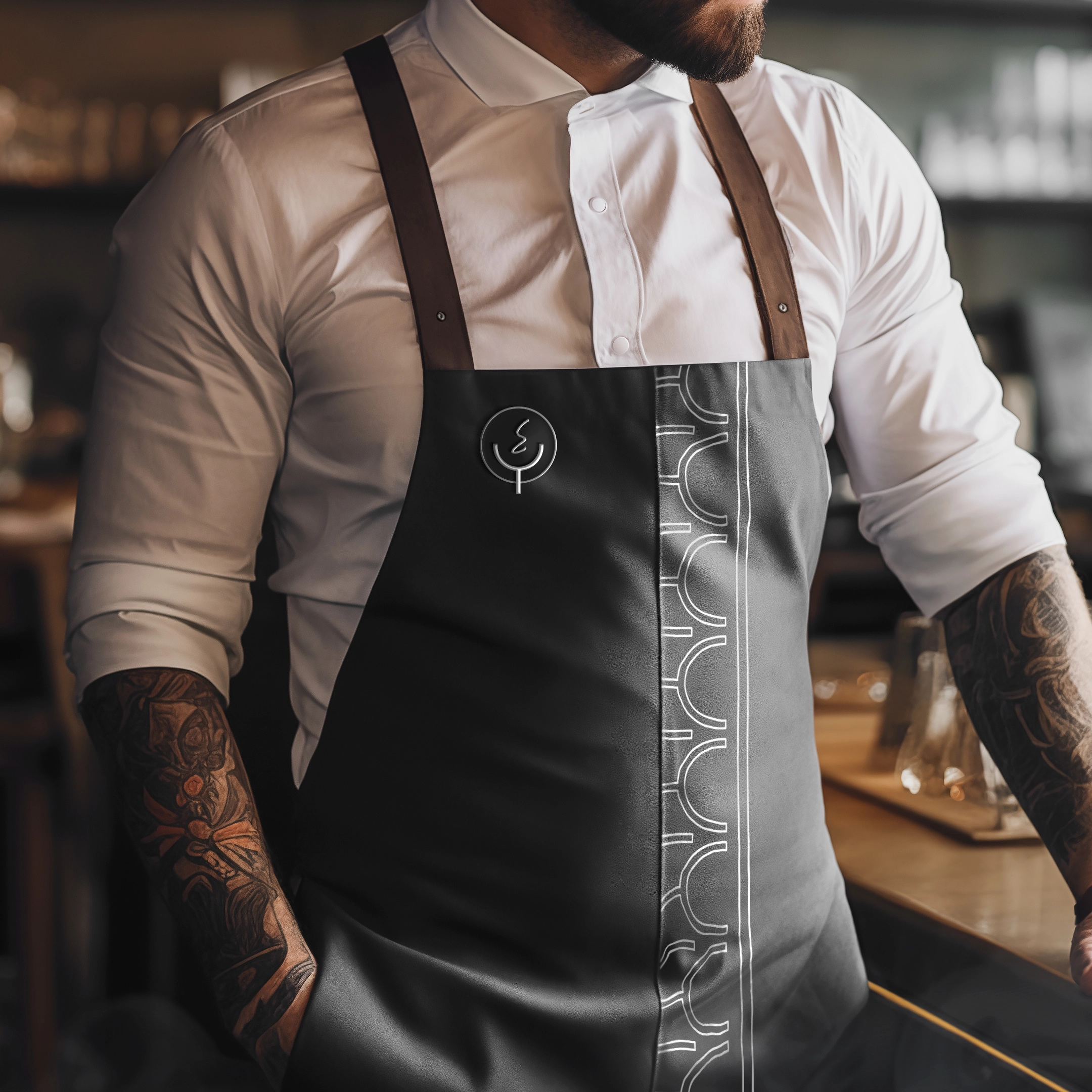
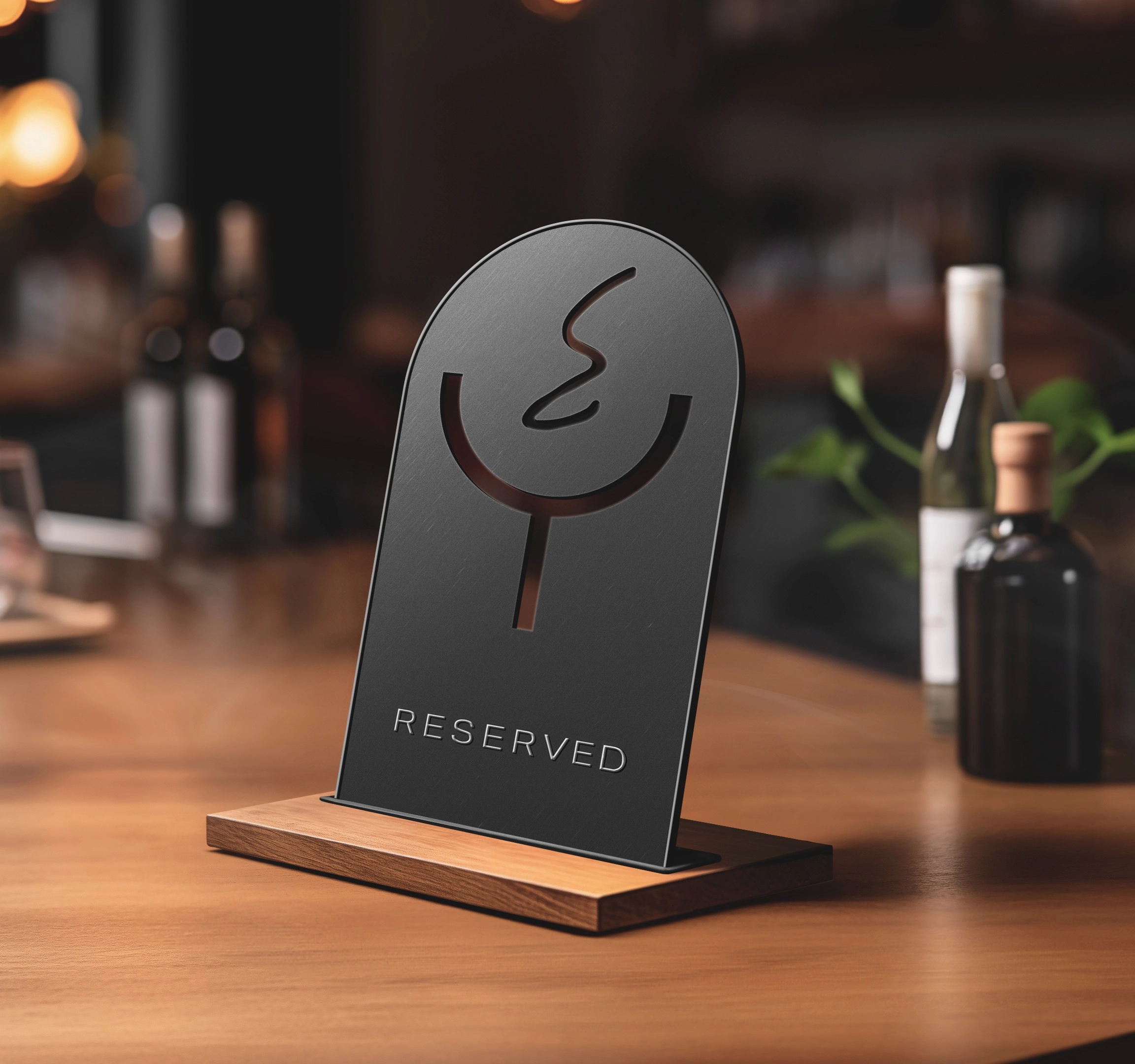
The logo needed to be immediately recognizable, clearly associated with the brand’s niche, and functional across different formats — including small digital icons. We developed a minimalist wordmark with a clean, modern font, and integrated a symbolic element: a stylized charcoal bowl with a thin smoke line. This monogram worked seamlessly both as a standalone icon and as part of the full logo. We also created a handwritten-style subtext for “Lounge Bar,” which added personality and helped reinforce the brand’s atmosphere. The result is a logo that captures recognition, emotional tone, and visual harmony.
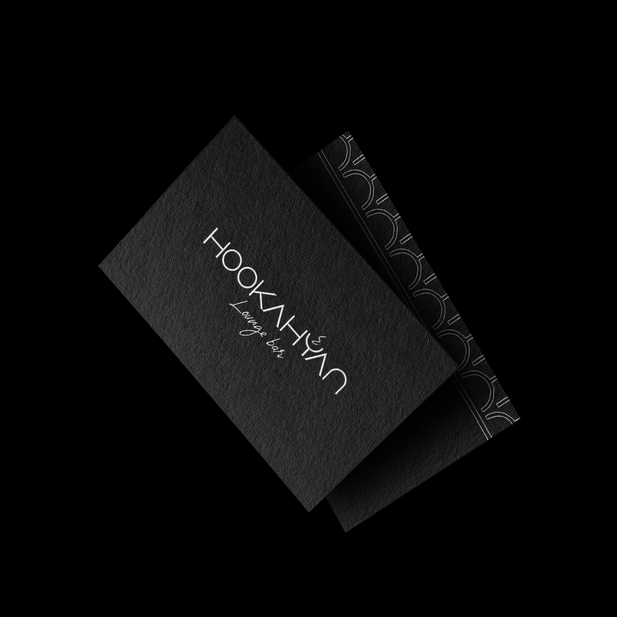
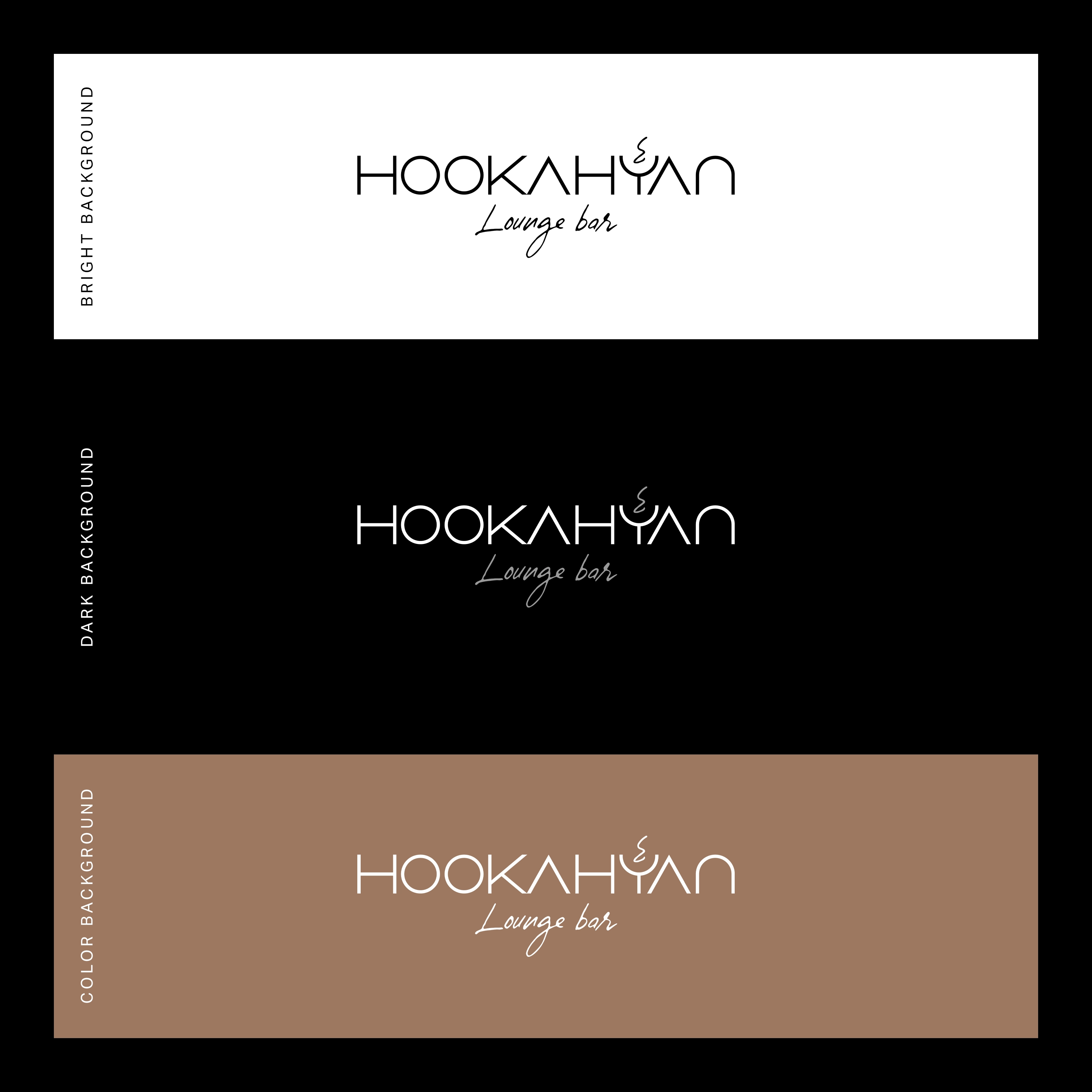
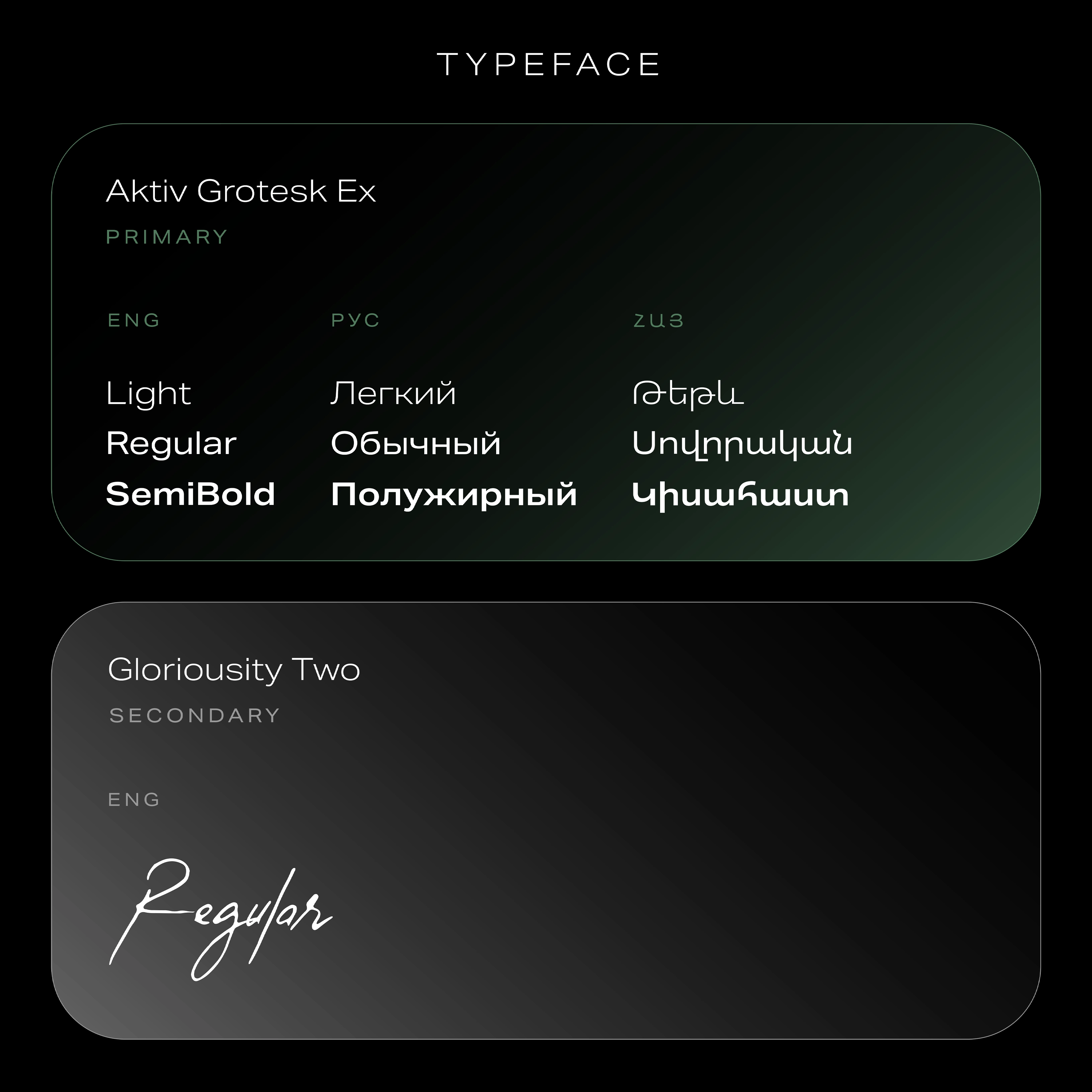
Visual Identity and Atmosphere
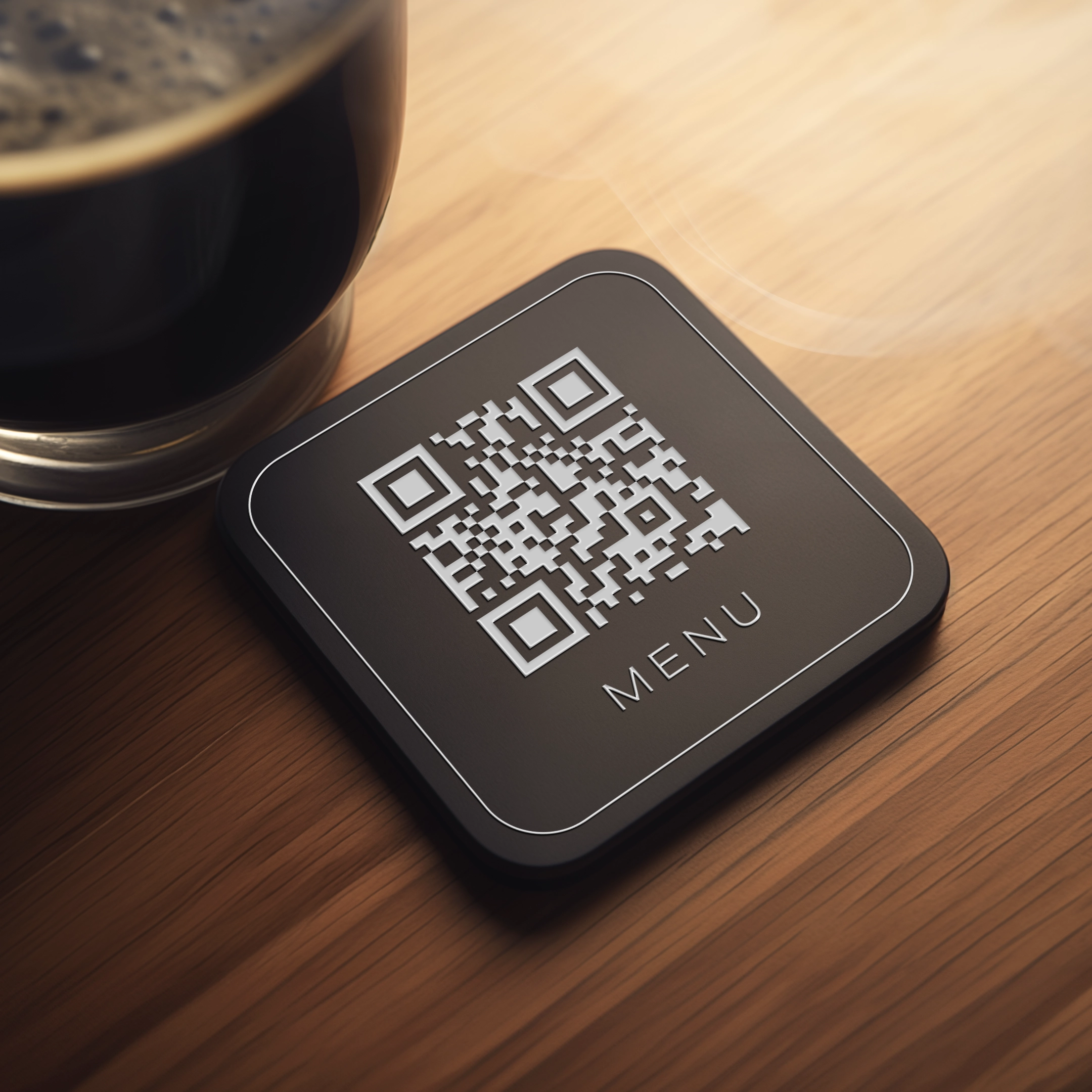
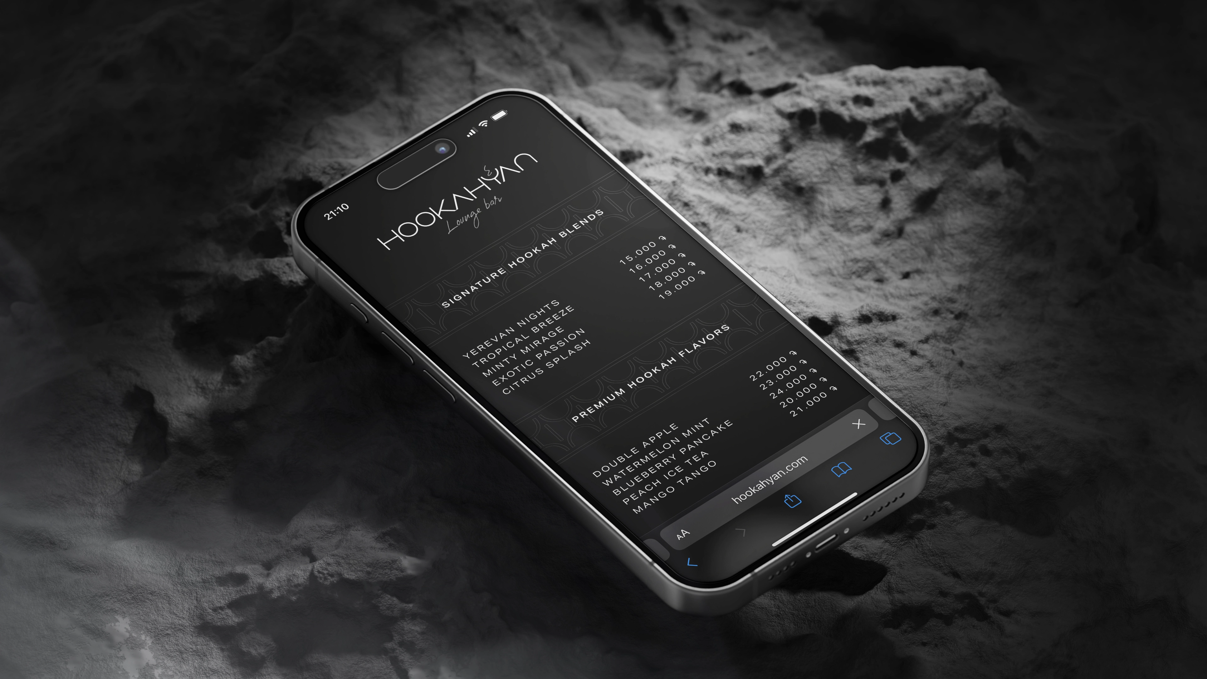
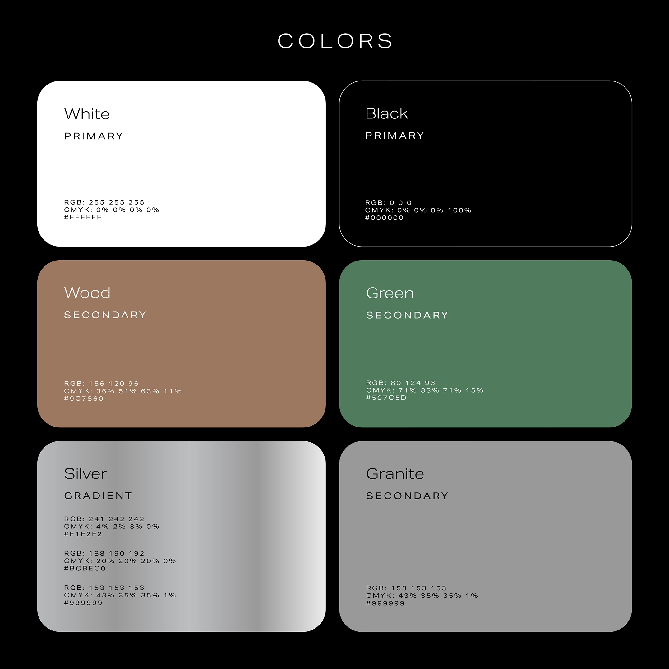
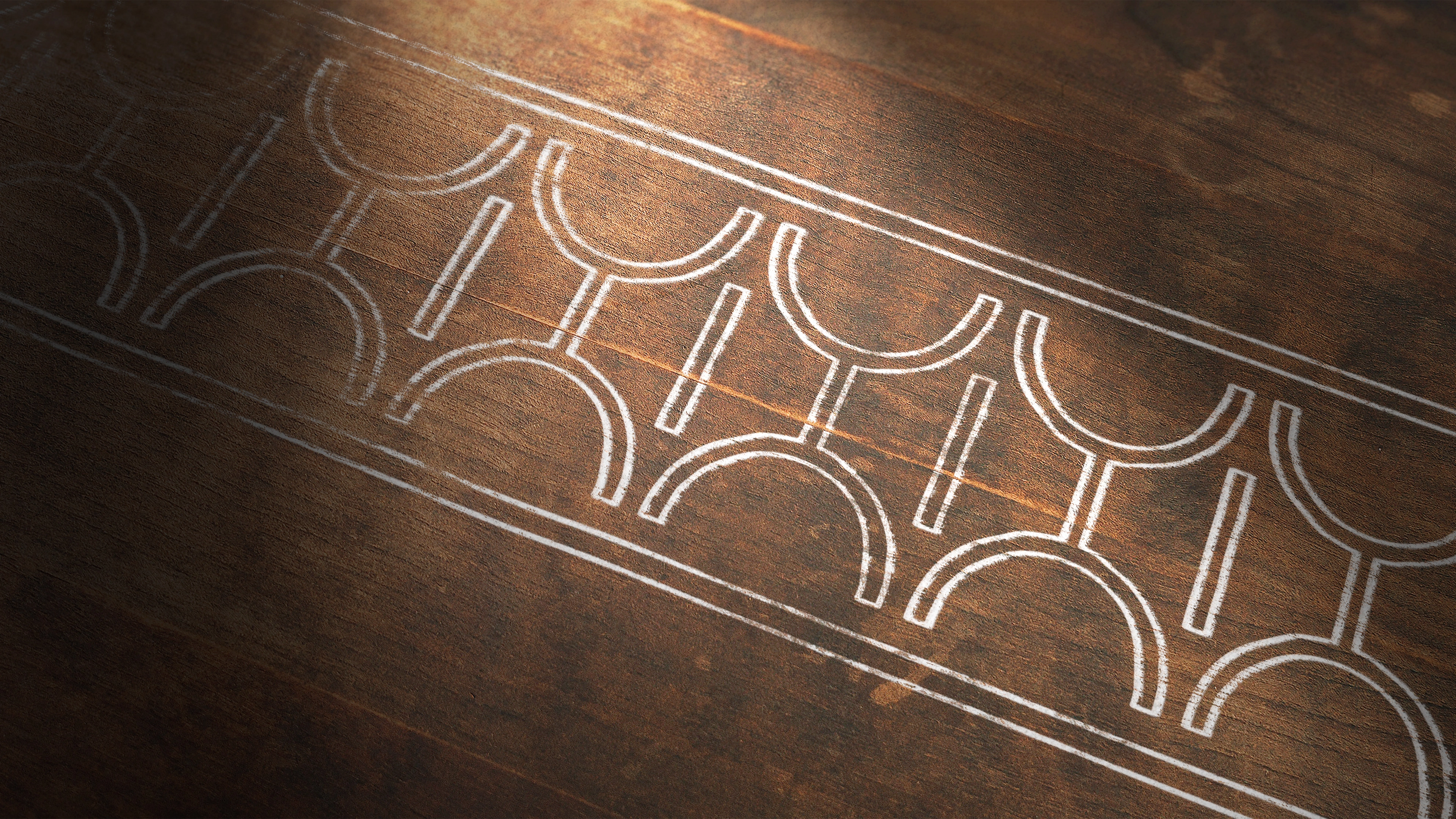
The visual system was crafted to extend the brand's identity across every touchpoint. We started with typefaces that complemented the logo, offering both legibility and a sense of modernity. Then we moved to colors, materials, textures, and patterns. The core palette — black and white — reflects purity and balance. Secondary tones — natural wood and greenery — bring comfort and a relaxed, organic vibe. Accents of metallic tones and granite grey add a sense of modernity and reference Armenia’s stone heritage. We also designed a repeating bowl symbol as a pattern, mirrored to create an ornamental motif inspired by multicultural aesthetics. Navigation elements were developed in the style of the logo’s smoke, with a handcrafted, metallic feel to complete the brand’s immersive visual environment.
Conclusion — A Cultural Brand
with Global Potential
Hookahyan is more than just a brand — it’s a cultural bridge between Armenian identity and contemporary lounge culture. We created a branding foundation that’s scalable, emotionally resonant, and visually cohesive. From the name to the tiniest graphic detail, the brand speaks clearly without explanation — inviting guests to relax, connect, and return. This is a project where branding didn’t follow the concept — it became the concept.
RELATED PROJECTS

V-NINE
⬢ BRANDING

SIROONI
⬢ BRANDING

FC NOAH X LIBERATED
⬢ BRANDING